Winners for I Am Woman 2021
Judge:
Shelley Ellis, Adjunct Faculty, UNC-Charlotte, Charlotte, NC
First Place
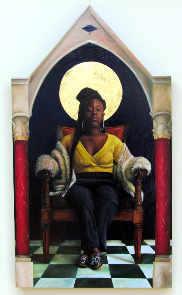
Cecil Norris – Het-Heru – oil painting
Judges Comments:
This is power. This is Renaissance painting versus contemporary woman and she wins. The size and shape of the canvas give weight and strength to the portrait. The attention to detail is impeccable. The face and the hair are so powerfully and meticulously rendered they are actually exquisite. The textual aspects of the fur, the damask shoes and the earrings give it a tactile feeling. The pink undertones on the fur really set off the texture and gives such depth and richness. It’s not photo-realistic but in places seems hyper realistic, this makes it even more intriguing and gives more power to the face. The textures that are in the painting versus the skin provoke the viewer to focus on the person, the woman. The negative space around the figure adds to the importance and increases the presence of the figure, this is especially true in the close proximity of the columns on either side. This architectural element and the shape of the canvas itself increases the importance and focus, an architectural framework for which the subject resides. Even as the viewer looks toward the bottom, in an attempt to escape the gaze of the subject, the black and white floor tiles force them to look back up and into the figure – into the face.
The gaze of the person in the portrait follows me through the gallery and causes me to keep looking back. As I was walking through the show looking at all of the work this painting actually took my breath away. I see sadness in that strength, power from hardship. This person will always prevail. She stares into my soul.
Second Place
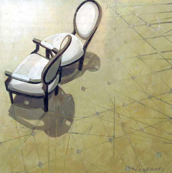
Anne Harkness – Private Conversation – oil painting
Judges Comments:
This work just opens up the mind of the viewer, our imagination creates a multitude of narrations. This is due to the chairs being empty but so close together and teetering almost banished to the corner of the painting. It is as if multiple conversations are going on all at once or are layered over one another. This comes from the treatment of the background. The floor pattern seems to repeat, but as a fading version of its former self. Subtle drawn lines all connect to the legs of the chair, bringing the viewer back to the chairs. The subtle hints of color, pink, green and yellow draw the eye back to the chairs. There are multiple light sources so delicately shown in the different cast shadows of the chairs themselves. The shadows cast by the chairs become almost figurative. The bright light that seeps into the painting from the top left corner of the canvas, highlights the chairs and brings focus to the impasto paint application on the arms. This offers an excellent contrast to the seemingly flat painting.
Third Place
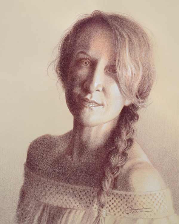
Todd Baxter – Jamie – colored pencil drawing
The soft almost sepia tone quality of this drawing lends an air of mystery. This is woman. There is openness behind those eyes. The built-up medium creates a texture against the paper that creates a sense of decay or loss. The image fades in and out as the viewer moves through the drawing. This drawing caught while intriguing from a distance, draws the viewer in with its texture and then draws you in further with the unexpected dashes of color in the hair, the subtle pink, the white highlights, give complete depth and texture to the integrity of the hair.
Merit Award
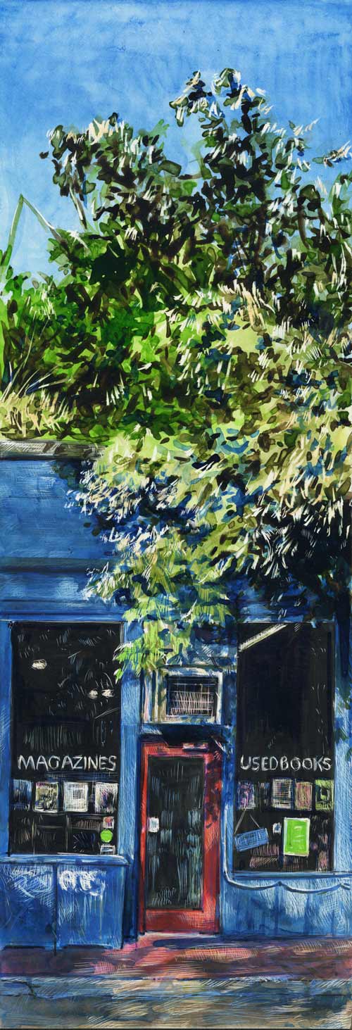
Lori McAdams – She Built This is 1988 – scratchboard, color inks
This work may be small but it is mighty, ripe with visual information. The verticalness of this small painting gives it importance. The bright contrasting color palette energizes the tiny space. The play of light, through the trees and onto the surfaces creates a great sense of visual depth. The subtle nature of the tiny marks created through the subtractive process, causes almost an electric feel. It’s almost as if the viewer can see the leaves move in the breeze, watch the patches of sunlight dance along the sidewalk and see the ripple of the reflection of themselves in the window.
Merit Award
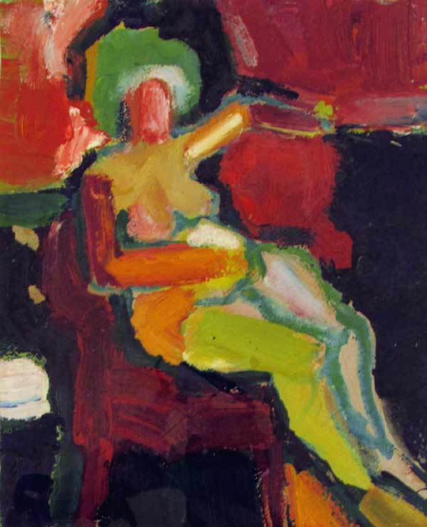
Sara Dame Setzer – Maternity – oil painting
This painting uses a minimal amount of brush strokes with intriguing color combinations. The texture of the mark and the color showing underneath, provides a visceral feel. It gives the viewer the impression of woman her strength, a hint at motherhood, bathed in light, seemingly surrounded by warmth. Then we notice the contrast of the greens versus the reds. The stroke of green calling attention to the head. The teal outline and one chartreuse leg, hints at the unknowing and anxious.
Merit Award
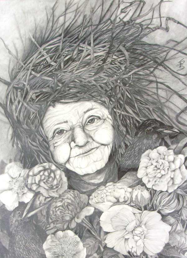
Stacy Pilkington Smith – Mother Earth – graphite
Through the full tonal range and the lack of color, the viewer can sense life in perspective. The viewer doesn’t need the name to understand and connect with this work. The idea of what it means to be a woman is often lead by ideas of youth and ideal beauty. However, there is beauty with age as well. With age comes wisdom and a life lived. There’s almost a wildness about this depiction. Energy abounds through the wrinkles. For the bountiful array of flowers to the hint of the nest, life cycles, the figural version of vanitas.