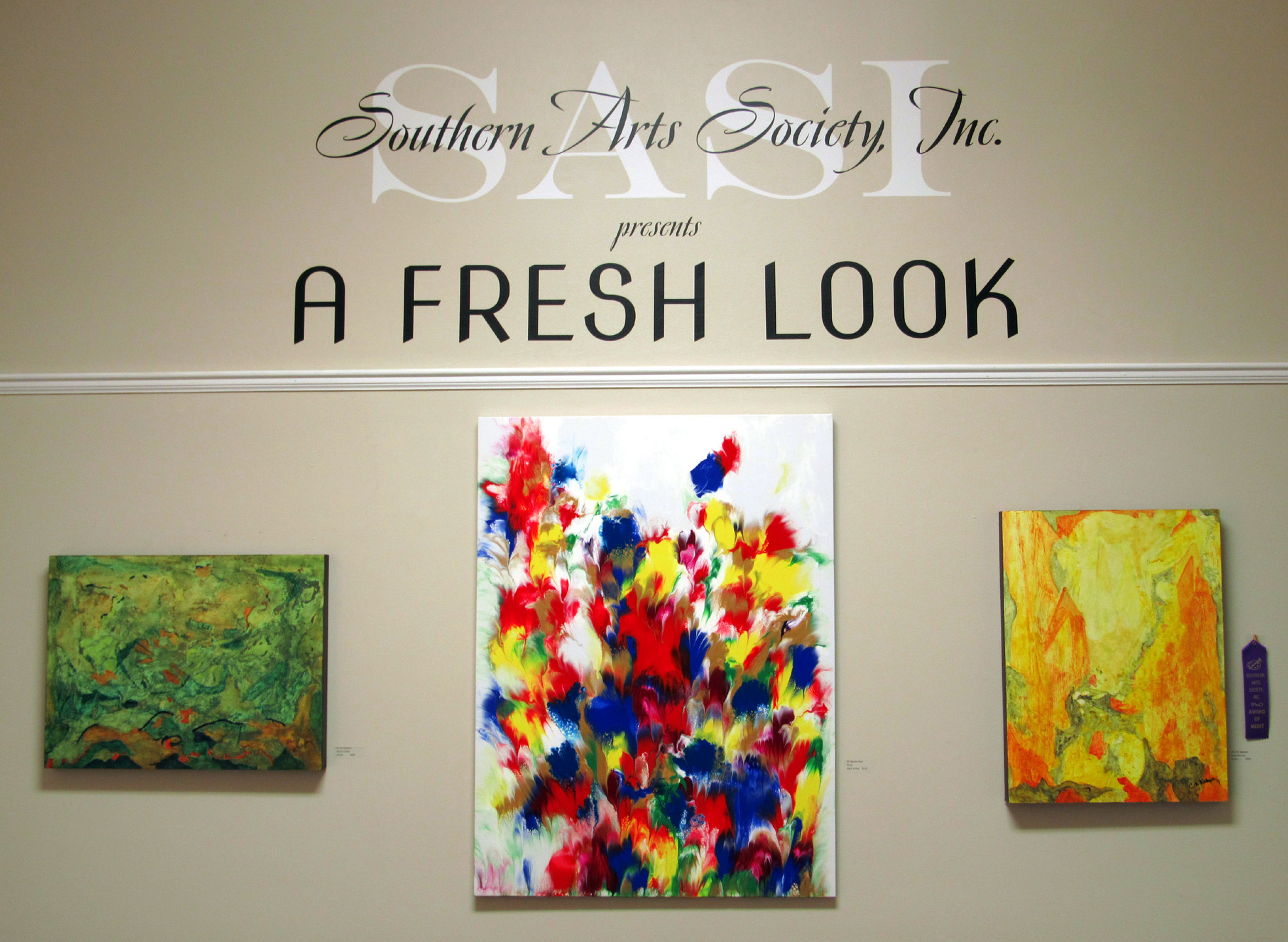
A Fresh Look Art Competition and Exhibit
On View July 7 – August 14, 2020
Take a Virtual Tour of the Exhibit Here
Even during a pandemic there is beauty all around us. Artists from around the region are displaying their artwork in Southern Arts Society’s latest show entitled A Fresh Look. Ninety-three pieces of art in a variety of media were entered to be judged for cash prizes. Artists were asked to show their most recent work taking a fresh look at the world around them – a very appropriate theme for these trying times. Though life may be unsettling, much of the work still focuses on the bright colors of summer, heartwarming themes, and the sanctuary found in the outdoors.
Winners for A Fresh Look
About the Judge
Born in Toronto, Canada, Felicia van Bork completed her undergraduate studies at the Ontario College of Art and Design University and earned her MFA at the Massachusetts College of Art and Design at the Fine Arts Work Center, Provincetown, MA.
The artist’s paintings and collages are widely collected in the United States and Canada and Felicia has been the recipient of numerous residency fellowships, including from the Virginia Center for the Creative Arts and McColl Center for Art + Innovation, where she manages the printmaking studio. In the summer of 2017, she was a Visiting Artist at the American Academy in Rome.
Van Bork’s collage, How to Mine the Past, is in the permanent collection of the Mint Museum of Art, Charlotte, NC. You can view her work on her website: http://www.feliciavanbork.com/
Judge’s Comments
Felicia van Bork
On my first walk-through of the exhibition, A Fresh Look 2020, I knew immediately that I would find plenty of technical proficiency. Among the over 90 works in the show, many show professional ability. There is also wit, originality, risk-taking, and soul. Congratulations to the artists and many thanks to Jewel Reavis for their terrific work.
First Place – Lore Spivey – $250
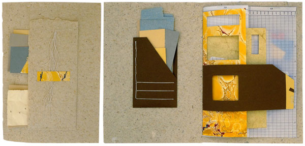
Keeping It Together – artist book – paper, string – #73

Piet – artist book – card stock, pva glue – #72
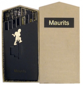
Maurits – artist book – card stock, pva glue – #71
Judge’s Comments:
The artist books of Lore Spivey, especially the book, Keeping it Together, have the quality of artworks made by an artist for her own delight. There is no sense of any ponderous effort to be impressive, yet these small works communicate technical skill, playfulness and artistic maturity. It is one thing to make a fine pictorial composition and another to make an interactive object that generates a different beautiful composition with every turn of its varied, perforated pages. While there is variety, there is no chaos. Rather, the materials, colors and textures present a limited palette with which the artist amuses her own astute eye. The cumulative effect is of a stroll through a cleverly designed building where each turn of a corner generates another pleasing aspect. The other two books, Piet and Maurits, are delightful tributes to Piet Mondrian and Maurits Cornelis Escher. How nice to see an artist doing riffs on greats from art history and literally getting inside their thinking.
Second Place – Barbara O’Neal Davis – $150
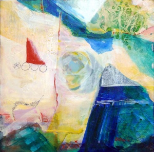
Narrow Passage – acrylic – #34
Judge’s Comments:
What struck me particularly about the acrylic paintings of Barbara O’Neal Davis, and in particular the painting, Narrow Passage, was the very different impressions given by the works viewed from up close and far away. From nearby, the colorful palette and intriguing textures attracted me, as did the contrast of the raw fine-line drawing to the bold flat shapes of color. The painting has a collage-like quality. (I have done a lot of collage myself and hold the form to a high standard.) The wow factor of Narrow Passage, however, lies in the way the painting generates an engaging illusion of an imaginary three-dimensional landscape. The successful use of atmospheric perspective really becomes apparent when the viewer is standing 10 feet away.
Third Place – Timmy Hord – $75
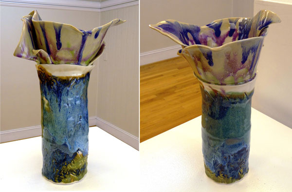
Floral Beauty – clay – #19
Judge’s Comments:
This is one of those amazing pieces that should not work. There is too much variety: there are too many different kinds of marks, shapes and colors for a coherent impression. In this piece it is the impossible, precarious balance of elements which makes the fact that Floral Beauty does work, so exciting. Just step back and you will see it. The icing on the cake is that it works from all sides. And although the piece has numerous visual textures, it does not have too many parts. The artist could have attached bud- or leaf-like structures, but instead she left the form relatively simple and abstract, trusting the imagination of the audience to fill in the rest. In my humble opinion, I think this beautiful work of utilitarian ceramic sculpture deserves a less literal title. (To get started, you could consider metaphorical book titles, for example, such as Rip it Up and Start Again or Why the Caged Bird Sings or The Wizard of Oz, and see how each one makes you look differently at the artwork. Of course, I would not use an actual book title unless that was a reference I wanted.)
Merit Award – Lori McAdams – $50
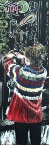
Little Barista – scratchboard, inks – #75
Judge’s Comments:
This is a very fine, very small artwork that shows just how beautifully the artist can draw. The figure is fresh and naturalistic, and the body’s gesture, shown from behind, is confidently indicated, particularly by the folds of the patterned sweater. If I were teaching scratchboard technique, I would gladly use a picture of this work as a perfect example of how to use scratch pen and colored ink.
Merit Award – Shelby Sabelli – $50
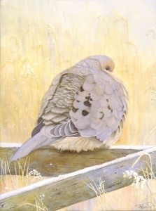
Shelby Sabelli – Frosty Morning – watercolor – #5
Judge’s Comments:
Exquisite detail and subtlety of color make this chilly, puffed-up mourning dove a pleasure to study. There is something about the dove’s somewhat undignified state which makes the seriousness and precision of execution all the more amusing and sweet.
Merit Award – C. M. Kakassy – $50
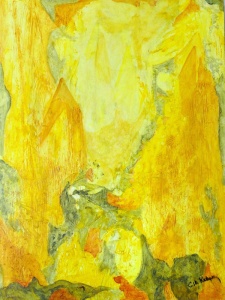
C.M. Kakassy – Early Morning – acrylic – #10
Judge’s Comments:
I don’t know whether C.M. Kakassy considers herself a visionary artist, but this painting draws the viewer into a spiritual opportunity for meditation. I saw a number of works in the show that leave a blank space near the center, right where the viewer is supposed to look. Usually, this situation is a compositional disappointment, but in this lovely painting, the light is the message and the composition conveys it eloquently.

